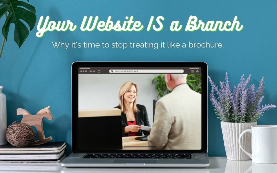
Why it’s time to stop treating it like a brochure.
Community banks don’t hesitate to invest big dollars into brick-and-mortar branches. New buildings, lobby renovations, drive-thru upgrades—it’s part of the plan. But when it comes to investing in their websites, too many banks hesitate.
That’s a problem.
Because the reality is this: your website gets more traffic than any physical branch ever will. It’s your most visited location, often your first impression, and for many customers, the only branch they’ll ever use.
It’s time to start treating your website like what it truly is—a fully functioning digital branch.
Beyond Brochureware
A bank website isn’t just a place to park your routing number or list today’s CD rates. And it’s definitely not just a digital version of your lobby signage.
A modern website should:
- Help customers understand your products and services clearly
- Guide users toward action. That could be opening an account, contacting a lender, or scheduling an appointment
- Reflect your bank’s brand, tone, and values
- Make it easy for customers to do what they came to do—fast
The problem is that many bank websites are still built on old assumptions:
“People just need our hours.”
“They can call us if they have questions.”
“Our website’s fine. It’s functional.”
But in 2025 and beyond, functional isn’t enough. A flat, confusing, or outdated website doesn’t just create friction—it creates doubt. And your customers have more digital options than ever before.
Why It Matters
In a recent episode of The Bank Marketing Show, we sat down with Brent Feldman, CEO of Matchbox Design Group, to unpack how banks can make smarter web design decisions. One of the key takeaways?
“A good website is a tool, but only if you commit to actually using it.”
That means going beyond the build itself. It means thinking about your website as an extension of your team—a place where customers can get questions answered, problems solved, and action taken without having to visit a physical branch.
3 Ways to Start Treating Your Website Like a Real Branch
Here are a few simple ways to rethink your site and make immediate improvements:
1. The 5-Second Test
When someone lands on your homepage, is it clear who you are and what you do within five seconds? If not, it’s time to revisit your messaging.
2. Speak Like a Human
Swap out internal or regulatory language like “residential lending solutions” for something your customers actually say: “Home Loans.” Simple language builds trust.
3. Make It Easy to Act
Is your primary call-to-action obvious? Can someone easily open an account or contact your team without digging? Friction kills momentum—clean, clear paths matter.
You Already Have the Traffic. Now Make It Count.
If hundreds of customers were walking through your physical branch every day but not being greeted, you’d want answers. So why let that happen online?
At Agora Eversole, we help community banks bridge the gap between in-branch experience and digital presence. Whether you’re planning a full website overhaul or just trying to make your current site work smarter, we bring clarity to the process and strategy that drives results.
Your website is a branch. Let’s help it work like one.